Saturday, January 4, 2014

Duplexed Holiday Card


The Refinery Creative Holiday Card - 2013


This is the third year I have had the opportunity to print the holiday card for The Refinery. They are a creative agency located in Los Angeles working primarily for entertainment clients. Each year a different designer works on the design... and since their print work is motion picture and television, designing in two color line art is a little different for them. 

I always look forward to printing their cards. Each year we do a flat card duplexed with a color stock. This year the back was Aspire Juniper Berry with Lettra on the front. It is a nice contrast between the smooth hard finish of the Aspire and the soft cotton feel of the Lettra.  The shimmer always gives me a challenge when mixing the ink to match. But isn't that part of the fun! It is for me. The second color was a red-orange which complimented the winter aqua nicely.

I hope all of those receiving these cards enjoyed them as much as I did printing them.

Saturday, November 9, 2013

Retro Contemporary Holidays


Holiday Cards to Match Your Style


If you have a flair for Mid Century Styling. Are Mad about Mad Men. Love that you can find contemporary versions of those retro classics, then these holiday cards are for you. 

The flames of the candles and the Star of David depict a Menorah on this modern Hanukkah card. Like real snowflakes, all the snowflake designs are unique and have a modern twist. The colors are muted, but contemporary and maybe a little unexpected. The wine and white circle pattern isn't a fabric from a slipper chair, but a graphic representation of glass ornaments on a silver tinsel tree. 


Friday, November 1, 2013

Custom Buckslips


G-star logo design


I was commissioned to design a buckslip. They would be for G-star, and she works in the entertainment print industry. So not only would I be designing for a client, but it would be a gift for a print professional. 

I began by choosing a font that I thought had a good shape. Then I altered the letterform to make the counter in the lower part of the g larger (The counter is the empty space in the lower part of the g). This gave me the perfect place to put the asterisk, which became the star. I found the perfect asterisk that went with the g and gave the logo the right balance. The hot pink color was an easy choice as it is a color she uses when signing off her emails. I placed the logo in the upper left corner bleeding off the top and left side. Some people are uncomfortable when artwork is cut off, but I loved the way the negative space worked with the edge of the buckslip.

The client and the recipient were both happy with the results. 

Monday, September 23, 2013

Valet Caramels

A Sweet Treat


Valet your car and when you get it back at the end of the evening you have a sweet treat waiting for you. National Apartment Flooring sponsored a valet event for a night. They wanted to do something different and memorable. A sample of carpeting was not what they wanted to do. So they created a card that took a spin on their tagline and related it to the caramels. Each cellophane bag included three pieces of golden caramel with the card tied with raffia.

Thursday, August 1, 2013

J+J Wedding


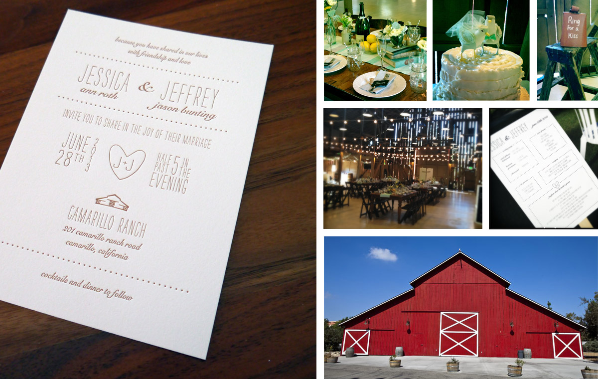
Jessica + Jeffrey  |  The Wedding


Jessica and Jeffrey's wedding ceremony and reception was held at Camarillo Ranch in Camarillo California. The outdoor wedding was held in the gardens outside the Queen Anne style home built in 1892. The weather was perfect for a garden wedding.

I was told by the bride that she would like the barn to be included on the invitation. Their reception was to be held in the barn. She liked the paper bag color and I thought it would be a nice color for this elegant and rustic wedding.

In addition to drawing the barn, I also created a hand drawn heart with their initials. I wanted it to have the feel of a heart with J+J carved in the wood on the barn. These two illustrations really personalized the invitation and other elements. In addition to the invitation and reply card, I also designed the program that was fashioned into a fan and recipe cards that they asked the guests to fill out at the reception. They were Recipe For A Good Marriage cards. 

The wedding was beautiful and the decor for the wedding and reception was lovely.